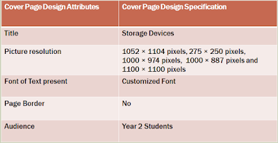
Design Specification
Design 1 and Annotations
Annotation Questions
How did you come up with the idea? Did something influence your thinking?
I came up with this idea by using ideas or inspiration from old cover pages that I have made in the past. I used ideas from my past cover pages and I also added my own twist to it. So I combined them together to create the cover page. I wanted to keep the cover page attractive but simple at the same time.
How could the idea be made? What tools, equipment and processes would you use?
I think this could be made by using software or websites on the internet that is available or easy to access. For example: Microsoft word, pic monkey, photoshop, painter etc.
Could the design be made in the time available and with your skills?
I think the design can be created with the amount of time that is available. I think that with my designing and ICT skills or techniques I could create the design well. However, If I improved some parts of the cover page, it would be more developed and advances. The idea behind creating the cover page on a software is not very hard since we know how to program them.
Is it safe?
The cover page is very safe. It is child oriented and very child friendly. The media, text and pictures used are appropriate.
Do you think your client would like the idea?
I think my client or audience would like the over page since its appealing and attractive. the pop of colour is fun and eye catching. Kids would also like this because there are many pictures to look at. Kids don't like to read a lot. Therefore, kids like more visuals or diagrams. I think my cover page really does portray that.
Why did you choose this colour/texture?
I chose to use very bright colours to make the cover page pop out and to attract the audience. The shapes that are located on the side of the page adds a very nice structure and layout for the cover page. I couloured the hexagons with warm colours. This is because warm colours generally don't bring that much attention to the audience. The purpose was for the title to sand out and not the shapes. The pictures and text are laid out in a specific format. A neat and structure layout always get's the audience's attention. The title is big and bold.
Annotations:
I chose design 1 because it was more suitable for kids and is also more attractive. I think the shapes was bringing out the pictures as well as the title. I also like the layout of design 1. The layout or format of design 1 is neat and well structure. Whereas, the structure of design 2 is laid out everywhere. The colour in design 1 is more brighter as well. I used Microsoft word and Google images to make this cover page. I was able to make the cover page in time of submission and annotate it in a separate page as well. All in all, I think design is more suitable as the cover page.
Design 2 and Annotations
Annotations:
How did you come up with the idea? Did something influence your thinking?
I came up with the the design by making a brainstorm with all my thoughts and ideas and then I combined them together to create the cover page. I used drawing from my previous designs but i modified them. I have made the layout simple and straightforward.
How could the idea be made? What tools, equipment and processes would you use?
I had first made a draft of the the cover page and then modified some parts of it. I think this could be made by using software or websites on the internet that is available or easy to access. For example: Microsoft word, pic monkey, photoshop, painter etc.
Is it safe?
The cover page is safe,It is child oriented and very child friendly. The media, text and pictures used are appropriate.
Could the design be made in the time available and with your skills?
I think the design can be created with the amount of time that is available. I think that with my designing and ICT skills or techniques I could create the design well. However, If I improved some parts of the cover page, it would be more developed and advances. The idea behind creating the cover page on a software is not very hard since we know how to program them.
Do you think your client would like the idea?
I think my client or audience would like the over page since its appealing. the pop of colour from the background makes it eye catching . Kids would also like this because there are many pictures to look at.
Why did you choose this colour/texture?
I chose to use very bright colours to make the cover page pop out and to attract the audience. I couloured the background lightly go make the text stand out. I made the title in bubble writing because it is bold and also stand out.The pictures and text are laid out in proper format. A neat and structure layout always get's the audience's attention.
Justification


No comments:
Post a Comment